FerrarGIS
Using QGIS to apply a 1777 style to today's OpenStreetMap data.
Context
In 2015, while I was working at the UGent Department of Geography, I was lucky enough to collaborate on a project around the 1777 Ferraris map - or more precisely the ‘Carte de Cabinet’ of the Austrian Netherlands by count Joseph de Ferraris. The Ferraris map is the result of the first systematic, large scale mapping effort in Belgium and even Western Europe; an impressive undertaking that resulted in a map detailing all houses, roads and forests in the surveyed territory. It is still widely appreciated today for it’s historical significance, archeological value and aesthetic qualities.
As a contributor to OpenStreetMap and user of modern GIS tools for desktop and browser, I had been dreaming for some time of applying the iconic style of the Ferraris map to today’s geographic data, wondering:
What would it look like if count de Ferraris would have made his map today?
So in this project, I strapped on a pair and took the tools I know as far as I could with that goal in mind. Let me tell you how that went. But first, here’s a peek at the result (drag the slider in the middle to compare):
Setup
After some exploration, I decided on a desktop oriented setup: I downloaded and stored the OpenStreetMap data of Belgium in a local Postgres database, loaded it in QGIS and did all the styling there, taking full advantage of QGIS’s powerful symbology and label styling features.
Styling
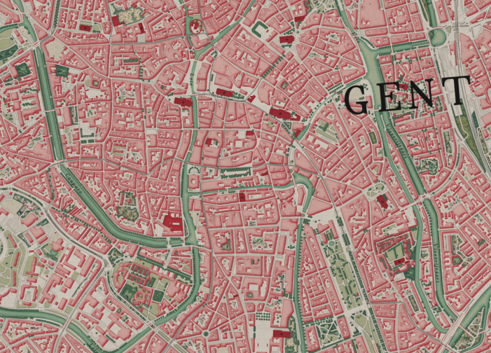
The Ferraris maps have a very recognisable style, but not every Ferraris map sheet looks the same. The three different copies that exist of this map (one is kept in the archives of Brussels, Amsterdam and Vienna respectively) as well as the long project time-span over which this map was produced, create quite some variability in the sheet styles. I selected the Ghent map sheet of the Brussels’ copy as the main point of reference for this project.
To make the QGIS style-sheet resemble the original Ferraris map as much as possible, I used carefully sampled colors and fill-images in the style definitions of the drawn objects. To obtain the right fill colors for things like buildings, grass and water polygons, I used a color picker tool to find the right colors on the old map. For more complex features like woodlands, marshes and heath that are drawn with beautiful textures and miniatures on the old map, I took a screenshot of such these drawings, used GIMP to clean up the images and make them seamlessly tileable, and then used them as the background images for the corresponding features.
To get as close as possible to the 1777 style, I used quite a few advanced QGIS features, including draw effects, drawing things as merged feature, adding some trees in a randomised way, styling polygons with gradient fills and adding a custom speckle layer on top of the map to give it an old finish. I found a suiting typeface called Youngbae which I used for the labels, and gave these a small tilt similar to what you get when you plot the old maps with their tilted north baring on top of a modern map.
Result
I’m proud of the final result. It’s not perfect, but I think it succeeds as a thorough exploration of recreating the old style with modern techniques and data.
There are some differences between my results and the 1777 map. For example, there are some polygon features I could have styled but didn’t, either because I didn’t find a corresponding image on the old map or because I didn’t like the result. Such areas include rocky areas, shallows/fords and, most notably, pine forests. Also, the old map’s place names were all in French. While I did add specific drawings for windmills, watermills and trees, the original map included many more drawings, for things such as gallows, battlefields, pillories and archery targets. I also didn’t find a suitable way (yet) to reproduce the map’s characteristic relief shading. Finally, the 1777 map didn’t have some modern features like railroads and tramlines, for which I chose to invent a suitable style.
You can find out more details on how this map was made or how to re-use this style on this project’s GitHub page. If you have ideas on how to improve this map, or want to use it in a project or exhibition, feel free to contact me at manuel.claeys.b@gmail.com!
Showcase
Here are some more examples of the end result. I’ve added some notes here and there on things that caught my eye. I hope you enjoy these maps as much as I do!
Some of the old forests are still intact. The Ferraris map is widely used to study the forest extent in Belgium.
The city of Mechelen was the starting point for count de Ferraris and his team. The natural features still define the layout of the city today.
While the coastal area has changed much, the street pattern in the city center is still exactly the same.
Next to the city’s fortified citadel, notice how the railway was built over the old town’s fortifications.
The difference between the changes inside and outside of the pre-industrial city walls are striking!
Notice how many hedges there were! Also, you can see how the city’s harbour extensions were mostly built in the extensive marshlands along the river.
Again, the old town hasn’t changed much. Also notice the fortifications of Damme in the North-East of the map.
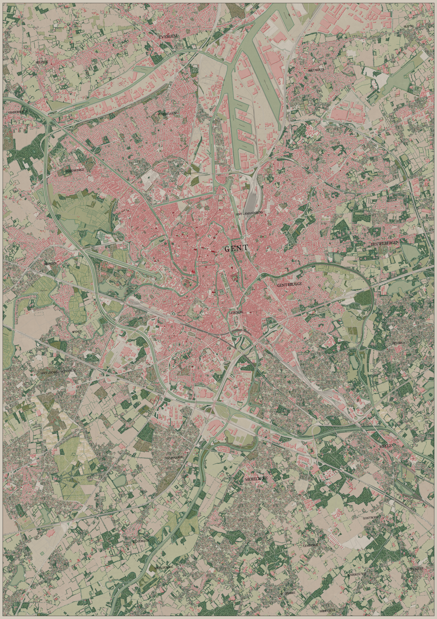
Closing off where we started with this map of Ghent and its surroundings. I’m quite proud to report that an A1 print of this map won first price at the 2022 FOSS4G-Be/SOTM conference during it’s map competition – which featured submissions as creative, quirky and diverse as the collection of geeky map enthousiasts participating at the conference.
— @ Home, 2021